What You Will Learn in This Article
If you are looking for some useful tips to make your WordPress forms convert better, then you’re at the right place. In this article, we will discuss how to implement some of the best practices. This will ensure that your forms are appealing and easy to use.
Increasing conversions is the dream of everyone who runs an online business. To help boost your conversions, you need to pay close attention to your forms. Making them so that they entice your readers to fill them out and submit. Below, I will go over some useful tips and tricks that you can use when building your next form.
Table of Contents
- Keep Your Forms Simple
- Add Tooltips and Placeholder Text
- Use a Multi-Step Form (if needed)
- Use Inline Validation
- Insert Basic Information
- Use Descriptive and Bold CTA
- Don’t Use All Caps
- Additional Resources
- Use Semantic Grouping
- Thank Your Users
#1 Keep Your Forms Simple
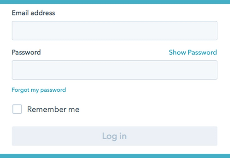
A form is a great place to connect with your users, but don’t go overboard. Ask as little information as possible. Don’t scare them away at the first step. Questions that ask for unnecessary information should be avoided. E.g. Instead of typing the password twice, you can have only a single field and include an option to show the password.
#2 Add Tooltips and Placeholder Text
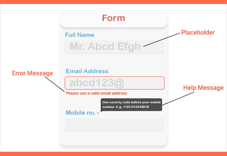
When your users are filling out a form on your website, guide them as much you can. Add tooltips or help messages to let them know why you are asking specific questions. The more transparent you are about your intentions, the more likely they are to convert.
#3 Use a Multi-Step Form (if needed)
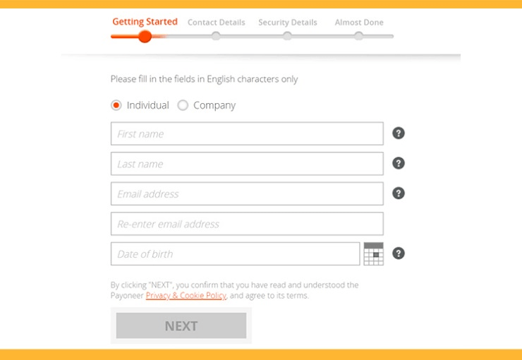
Single-step forms are for login and sign-up pages where all actions are completed in a short, single form. But sometimes you need a big form with a lot of fields to collect more data. In that case, don’t use a long form because it can be frustrating to your users. Instead, use a multi-step form based on information groups. It’s also a good idea to let the user know about their progress with a progress bar or steps, e.g. step 1/3.
#4 Use Inline Validation
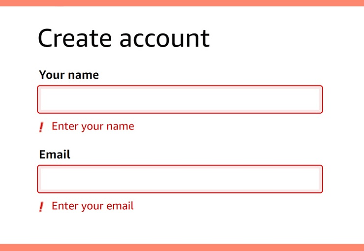
Users sometimes make unintentional errors while they type, but you can help prevent this by setting up instant validation. The best practice is to show a warning for an invalid input when they have completed one field. Never validate during their data insertion. For example, when they have completed the email field and forgot to add the ‘@’ sign, let them know about it.
#5 Insert Basic Information
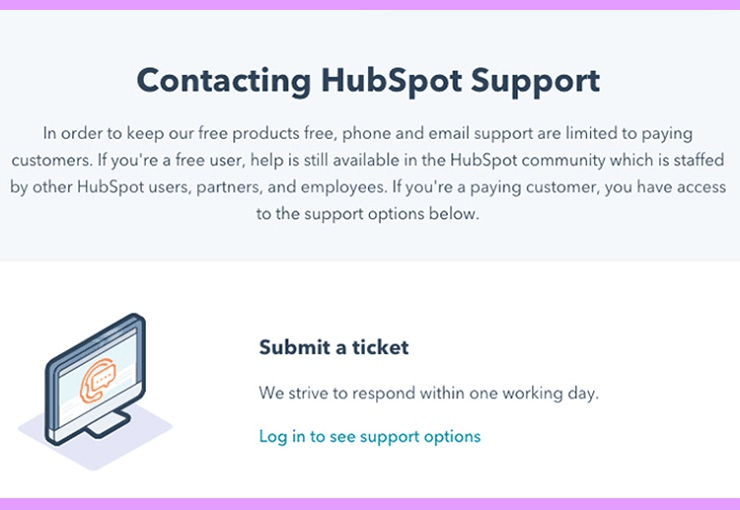
Help your users understand what the purpose of your form is. A form can be confusing without any description, but it can be easy with some useful guidelines. If your company provides services, then you can set up a dedicated support form for existing customers in addition to a general contact form. Moreover, mentioning information such as the wait time, reasons for using the form, etc. can help earn more trust.
#6 Use Descriptive and Bold CTA
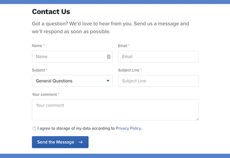
Whatever you do with your form, the call to action is the most important feature. Make sure your forms look noticeable and lucrative, so that they never fail to grab the user’s attention. Other than making the call-to-action button bold and bright, you should also make the text stand out. Users should know what happens when they click the button. Submit means they’re going to submit their data whereas subscribe illustrates they will receive a newsletter. If you can make it more descriptive with text like “Show me the exclusive offer” or “I want exclusive access,” then do it.
#7 Don’t Use All Caps
What’s wrong with all caps? Human eyes are comfortable with what they see regularly. Sentence case is the most repeated things we look at when we read something, be it online or offline. That’s why all caps are difficult to scan. This gives an unpleasant experience for the user. When you write placeholder text and labels for the input fields, keep them in sentence case as well.
#8 Additional Resources
You can add a FAQ section next to your contact form which may reduce the rate of unnecessary form submission. At the same time, users can get a basic understanding of the form.
If you have documentation for products or other helpful resources like video tutorials or in-depth blog posts – include them in the contact page.
#9 Use Semantic Grouping
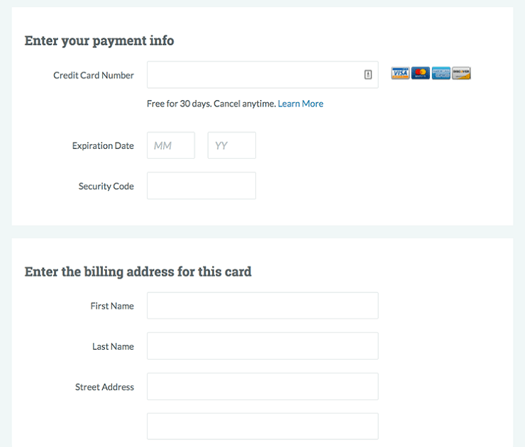
In general, human sight works from left to right and top to bottom (of course, there are exceptions). Semantic groups allow users to put their data in a very organized way which ensures a better conversion rate. Keep the personal info in one section, address and billing in the other. No matter how big your form is, or how much information you are going to collect, keep everything fragmented.
#10 Thank Your Users
They made some effort and spent the time to complete the form. Now it’s time to thank them. Right after they click the submit button, show a thank you message. You could take things to a new level by redirecting them to a custom page. This could be a product landing page or a simple blog page.
My Final Thoughts
Gaining attention from your users requires an overall improvement of your website. But, you can turn your forms into a conversion tool by applying the tips mentioned above. Don’t just consider your WordPress forms as a simple means to collect data. They can also play a vital role in building a loyal customer base.
Hopefully, this article has given you a better understanding of how forms work and what you can do to make them convert better. Have a question? Please feel free to leave us a comment below.
If you enjoyed this tutorial, please be sure to follow us on Facebook and Twitter. You can also find us on Freelancer if you need some help with your WordPress website or web development issues.

